
In today’s continuation of its big two-day conference, Xiaomi showed an unexpected new feature – a redesign of its logo, which, according to the company’s founder Lei Jun, it has been working on since 2017.
A modern logo in motion
The company’s goal and their designer, who had his own opening statement at the presentation, was to bring a more modern and up-to-date look.
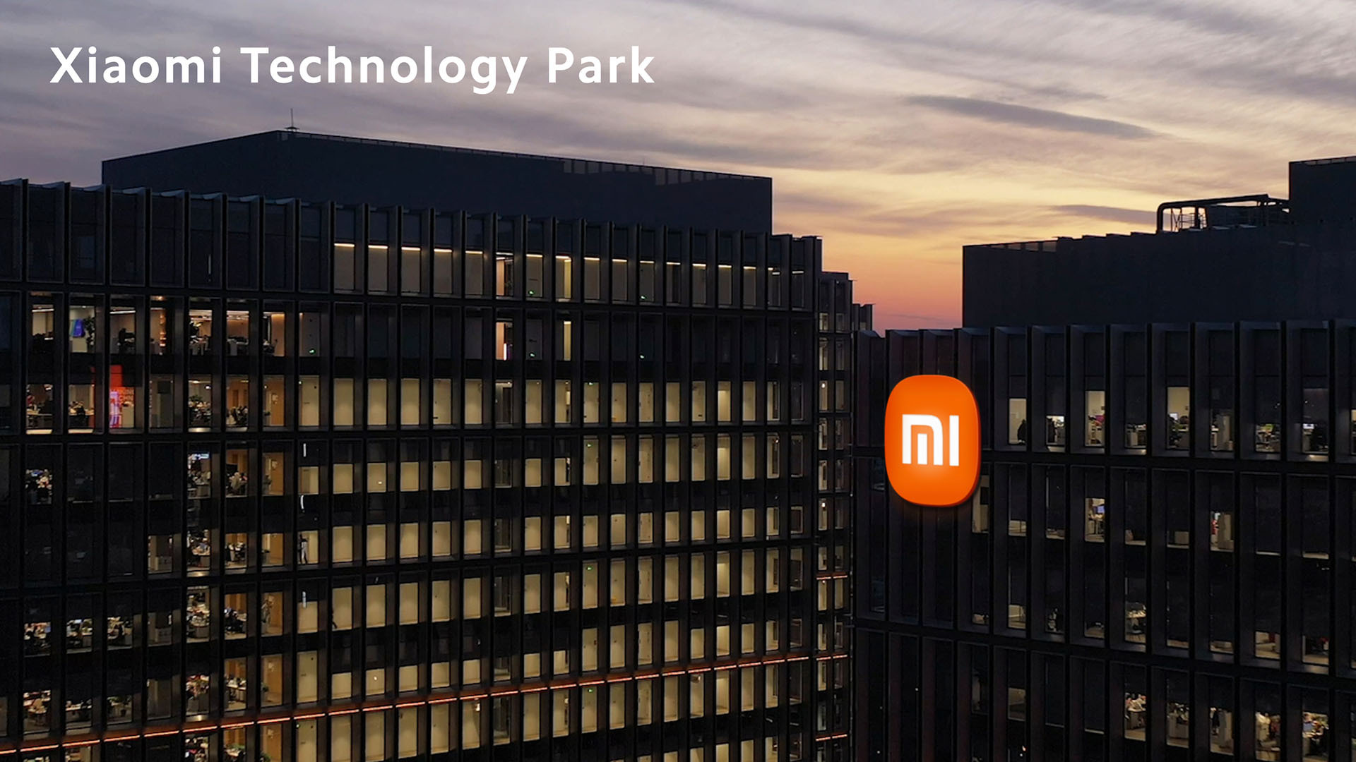
They achieved this by changing the orange square shape into a rounded rectangle. They were looking for new possibilities between a square and a circle, and in the end they chose the variant you can see above in the picture.


Another element of the logo that’s been mentioned a lot is its dynamism. The lead designer, Hara Kenya, showed us how the logo can be used directly in animated graphics. They’ll use the logo with dynamic animations, and it will always create some kind of movement. This is achieved by a sort of wave of rounded edges.
Math helped them find the perfect shape
At the presentation, they also showed a complex design process, where they used a mathematical equation when creating the main logo to find the perfect balance between a circle and a square.


We could also see a number of unused drafts that followed the creation of the final design. This proves that the work was truly lengthy and demanding.
The mentioned changes are commented on directly in the video by its author, graphic designer Hara Kenya:
For everyday people, this change may seem trivial, and they won’t understand the excessive attention to this redesign. But the brand and identity are very important for a corporation like Xiaomi. However, we can emphasize that Xiaomi sticks to its traditional orange color, and even the shape of the Mi lettering hasn’t changed radically.
So the Chinese giant didn’t follow massive identity changes like carmakers Peugeot and Kia, or some major football clubs such as Inter or Juventus.
Don’t miss the best coupons 📩
Subscribe and we’ll email you new coupons before they expire. We only send it once a month — no spam.